# Premium Permanent Makeup Design Concepts
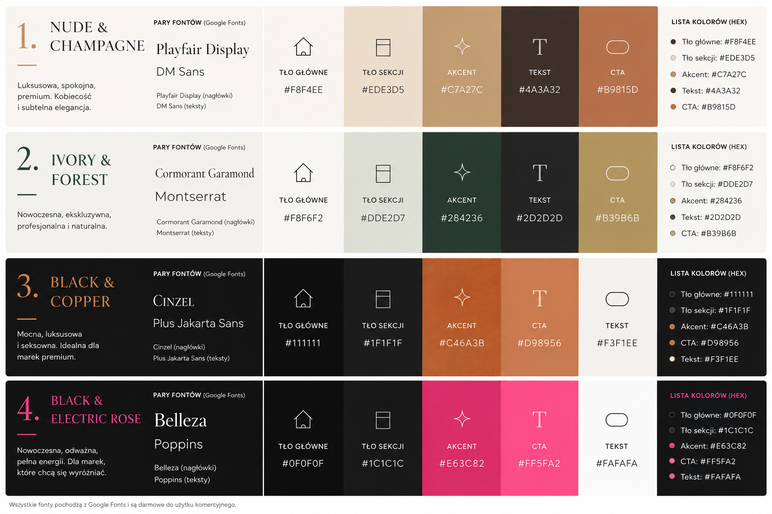
To create an upmarket and premium feel for a permanent makeup service, the design should focus on sophistication, cleanliness, and elegance. Below are four distinct color schemes and Google Font pairings tailored for this industry.
—
## 1. The Timeless Minimalist (Clean & Sophisticated)
This palette focuses on high-contrast neutrals and plenty of whitespace to convey a sense of medical-grade precision and high-end service.
* **Color Palette:**
* **Primary:** #000000 (Pure Black) – For bold headlines and primary CTA backgrounds.
* **Secondary:** #FFFFFF (Pure White) – The foundation of the layout.
* **Accent:** #F5F5F7 (Soft Platinum) – For section backgrounds and subtle borders.
* **Detail:** #8E8E93 (Cool Gray) – For secondary text and icons.
* **Typography Pairing:**
* **Headings:** [Playfair Display](https://fonts.google.com/specimen/Playfair+Display) (Serif) – Adds a classic, high-fashion editorial feel.
* **Body:** [Inter](https://fonts.google.com/specimen/Inter) (Sans Serif) – Modern, highly readable, and professional.
—
## 2. The Nude Aesthetic (Organic & Skin-Centric)
Perfect for a brand that emphasizes natural-looking results and skin health. It uses warm, fleshy tones that feel inviting and soft.
* **Color Palette:**
* **Primary:** #4A3728 (Deep Umber) – Rich brown for readability and depth.
* **Secondary:** #EAD7C3 (Soft Sand) – A warm, skin-toned neutral for hero sections.
* **Accent:** #F9F4EF (Off-White Cream) – For the main background.
* **Detail:** #C5A082 (Golden Taupe) – For buttons and decorative elements.
* **Typography Pairing:**
* **Headings:** [Cormorant Garamond](https://fonts.google.com/specimen/Cormorant+Garamond) (Serif) – Elegant and fluid, reflecting the artistry of PMU.
* **Body:** [Montserrat](https://fonts.google.com/specimen/Montserrat) (Sans Serif) – Balanced and clean, providing a modern contrast.
—
## 3. The Modern Luxe (Bold & Glamorous)
This scheme targets a younger, trend-conscious demographic that wants a “red carpet” experience. It uses deep, moody tones with metallic-inspired accents.
* **Color Palette:**
* **Primary:** #1A1A1A (Carbon Black) – For a sleek, dark background or heavy headers.
* **Secondary:** #D4AF37 (Metallic Gold) – For icons, highlights, and primary buttons.
* **Accent:** #2D2D2D (Dark Charcoal) – For subtle UI depth.
* **Detail:** #F2F2F2 (Snow White) – High-contrast text on dark backgrounds.
* **Typography Pairing:**
* **Headings:** [Cinzel](https://fonts.google.com/specimen/Cinzel) (Decorative Serif) – Inspired by classical Roman inscriptions, conveying authority and luxury.
* **Body:** [Raleway](https://fonts.google.com/specimen/Raleway) (Sans Serif) – Sophisticated with unique letterforms that feel “designed.”
—
## 4. The Soft Ethereal (Calm & Serene)
Focused on the spa-like experience and the “waking up with makeup” ease. It uses cool, muted tones to create a calming environment.
* **Color Palette:**
* **Primary:** #5F6769 (Muted Slate) – A soft, professional gray-blue for text.
* **Secondary:** #D1E5E7 (Powder Blue Mist) – A very pale, refreshing accent.
* **Accent:** #FAF9F6 (Alabaster) – A bright, warm-leaning white for the main canvas.
* **Detail:** #A7BBC7 (Dusty Blue) – For hover states and secondary buttons.
* **Typography Pairing:**
* **Headings:** [Libre Baskerville](https://fonts.google.com/specimen/Libre+Baskerville) (Serif) – Trustworthy and traditional but with a softer edge.
* **Body:** [Lato](https://fonts.google.com/specimen/Lato) (Sans Serif) – Friendly yet professional, ensuring the brand feels approachable.
—
### Implementation Advice
For a premium look, remember that **less is more**. Use large, high-quality imagery of results, maintain generous margins (padding), and ensure your typography has enough breathing room (line-height).